

Top CSS Interview Questions and Answers 2023
Cascading Style Sheet(CSS), is a web page styling technology which is responsible for how the HTML elements will be displayed on the webpage.
Example: text color, background CSS color, font style, column size, layout designs, etc. By defining the styling in CSS we can control the web page layout for the whole website. CSS is independent of HTML and can be used with other mark-up languages as well.
Features of CSS
Potential Drawbacks
Beginner Level CSS Interview Questions and Answers
- What do you understand about box models in CSS?
- Explain the different selector types in CSS.
- What is the difference between ID and class selectors in CSS?
Intermediate Level CSS Interview Questions and Answers
- What are the differences between CSS variables and preprocessor variables?
- What are the different types of media properties in CSS?
- What is DOM reflow in CSS?
- Explain the difference between inline, block, and inline-block elements.
- What are CSS sprites and their benefits?
- What is the difference between visibility: hidden and display: none?
Advanced level CSS interview questions and answers
- What is the position property in CSS?
- What is CSS flexbox?
- What is progressive rendering in CSS?
- What is Block Formatting Context in CSS?
- What are pseudo-elements and pseudo-classes in CSS?
- What does important mean in CSS?
- When to use CSS flex and when to use a grid?
Features of CSS
Separation of content from style: Content and the css can be kept at different locations, which is also the recommended best practice. With this approach, the same content can be presented on different devices easily by using separate styling sheets, which leads to accessibility.
Multiple ways to incorporate CSS: There are many ways to incorporate CSS into HTML, the popular ones are below.
- External files: An external .CSS extension file can be created and added to the HTML.
Example:
<link rel="stylesheet" type="text/css" href="examplestyles.css" />
- In-line CSS: The style is added directly via attributes of the various HTML elements.
Example:
<h2 style="color:black;background:red">Inline Style Example</h2>
- Internal CSS: The style is added at the top of the HTML page, inside the <style> element.
Example:

<style type="text/css">

  /*Add style rules here*/

 </style>
Cascading: In the CSS style sheets we mention a cascading order, the sheet which has the highest priority will decide the content display. Cascading order defines which style will be applied to an element if there are multiple styles defined for it. Below is the priority level where the in-line style overrides the other two.
- In-line style
- External and internal style sheets
- Browser default
Frameworks: There are multiple frameworks available for quick development and customisation.
Example: Bootstrap, Foundation, etc.
Potential Drawbacks
- Cross-browser compatibility can be tricky to achieve since CSS behaves differently on different browsers.
- Different levels of CSS causes confusion, such as CSS 1, CSS 2, CSS 3 etc.
- It may pose security issues such as code injections, attacks from malicious 3rd party resources in DOM(Document Object Model).
Beginner Level CSS Interview Questions and Answers
1. What do you understand about box models in CSS?
In CSS every element is considered to be wrapped into a box, having multiple layers. This concept is known as the box model in CSS.
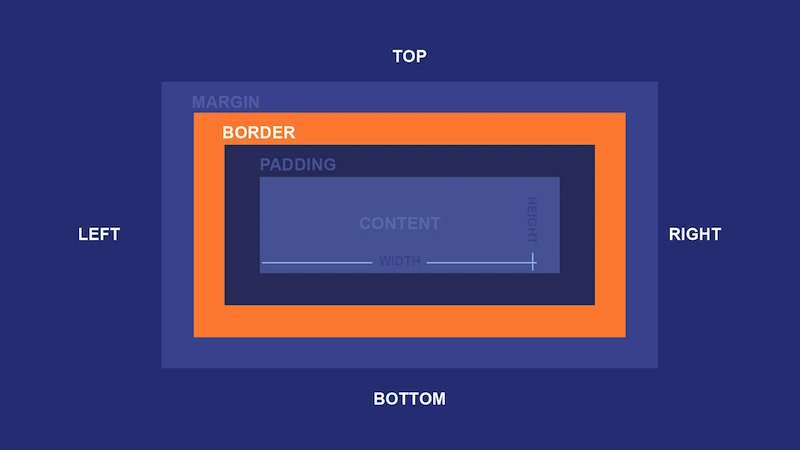
The different layers/sub-boxes in the CSS box model are:
- Content: It contains real content such as text, image, video, etc. The dimensions are defined by content-width and content-height. It often has a background CSS color or background image.
- Padding: It provides padding around the content area, usually in a similar CSS color as of the content sub-box. The dimensions are defined by padding-box width and padding-box length.
- Border: It is a sub-box that surrounds the padding of the element. In the below picture it is visible as a darker border around the padding area.
- Margin: This sub-box is not visible, but acts as a white space to separate two HTML elements. This sub-box surrounds the border area, the dimensions are defined as margin-box width and margin-box height.
2. Explain the different selector types in CSS.
CSS selectors help to select the content which we want to style. Different CSS selectors are:
- Universal selector: Selects all the elements on the page, marked by an asterisk(*).
Example:
* {
text-align: center;
color: red;
}
- ID selector: Selects a specific element on the page using its ID, marked by hash(#).
Example: Selects the element with a unique ID as ‘element1’.

#element1 {
   text-align: center;
   color: red;
}
- Element type: Selects an element based on the element type/name.
Example: Selects all the <p> elements.

p {
   text-align: center;
   color: red;
}
- Class: Selects elements with the specific class attribute, defined by writing a dot(.) and class name.
Example: Select elements with the class attribute as ‘center’, make them aligned in the center, and with the color red.

.center {
  text-align: center;
  color: red;
}
- Attribute: Selects elements based on the value of HTML attributes, defined using square brackets.
Example:
input [type=”text”]
{
  background-color: #444;
  width: 200px;

} <input type="text">
- Combinator selectors: Selects elements based on the relationship between them. Example: Descendant combinator, child combinator, general sibling combinator, and adjacent sibling combinator.
Read more about combinator selectors here.
3. What is the difference between ID and class selectors in CSS?
ID selector in CSS is used to identify a single unique HTML element, e.g. header, footer.
However, the class selector is used to identify one or more than one element, e.g. buttons, links.

Intermediate Level CSS Interview Questions and Answers
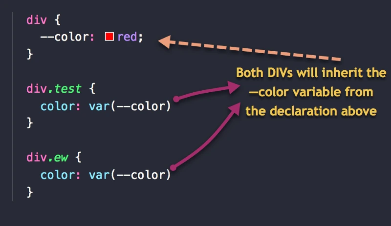
4. What are the differences between CSS variables and preprocessor variables?
| CSS variables | Preprocessor variables |
| Also known as custom properties of CSS. | They can be of different types such as
SASS(Syntactically Awesome Style Sheets), LESS(Leaner Style Sheets), SCSS(Sassy CSS). |
| Defined by syntax --variable-name. | Defined by syntax @variable-name/ $variable-name. |
| The variable’s scope needs to be defined as in JavaScript. | The variable is assigned to the CSS properties such as color, margin, padding, etc. |
| CSS variables cascade. | They do not cascade. |
| They are dynamic, we can change them dynamically through JavaScript or CSS. | They are static, we cannot change them dynamically. |
Example of CSS variables:
5. What are the different types of media properties in CSS?
There are four types of @media properties in CSS:
- All - default value used for all media types.
Example:

@media all and (max-width: 699px) and (min-width: 520px), (min-width: 1151px) {

  body {

    background: #ccc;

  }

}
- Print - used for printers.
Example:

@media print {
  body {
    color: black;
  }
}
- Screen - used for screens such as computers, mobiles, tablets, etc.
Example:
@media screen {

  body {
      color: green;
  }

}
- Speech - used for screen readers that read the page as voice output.
Example:

@media speech {
  code {
    speak: literal-punctuation; /* Reads all punctuation out loud in VoiceOver */
  }
}
6. What is DOM reflow in CSS?
DOM reflow is a process where the dimensions or positions of the elements are re-calculated for re-rendering the document. It is triggered when:
- Update/insert/remove an element in the DOM
- Move or animate a DOM
- Modify the content of the page e.g. text, image.
- Add/remove a stylesheet or change CSS style.
- Resize the window
- Take element measurements using offsetHeight or getComputedStyle
Reflows are expensive because a single change may trigger reflow for all children, siblings, and ancestors of the element. There are ways to minimise CSS DOM reflow, you may read them here.
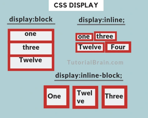
7. Explain the difference between inline, block, and inline-block elements.
| Inline | Block | Inline-block |
| Does not start on a new line. | Does start on a new line. | Does not start on a new line. |
| Width and height values cannot be set. | Width and height values can be set. | Width and height values can be set. |
| Example: span, image | Example: div, h1, p | For example ‘display’, we can set the width and height. |
- The image below shows that the inline never starts from a new line and has a fixed width and height.
- Block always starts from a new line and width and height can be changed.
- Inline-block is similar to inline, but the width and height can be set.
8. What are CSS sprites and their benefits?
CSS image sprites are collections of images, combined into one single image file. If a web page has many images, then loading the images and many server requests will be expensive. To reduce the bandwidth, CSS image sprites are used.
Example: A web page uses three separate images. If we will store and use them separately we need to handle three images. Instead of using three individual images, CSS sprite merges them into one image file. We show only a portion of this single merged image file by providing the appropriate dimensions.
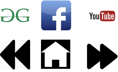
To combine the images into one, we use an image generator which generates the CSS for the sprite. Read more about CSS sprites here.
Benefits
- Reduces server requests and image loading.
- Improves SEO, since the page load will be faster.
- Reduces image size by combining many into one.
| visibility:hidden | display:none |
| Space will be allocated between tags. | No space will be allocated for this. |
| Tag is rendered but not visible on screen. | Tag is not rendered at all. |
| Example | Example |
Advanced level CSS interview questions and answers
10. What is the position property in CSS?
Position property defines the positioning method used for an element in CSS.
Syntax:
position: static|absolute|fixed|relative|sticky|initial|inherit;
The position property can take any of the below values:
- Static: Default value, elements are rendered in order.
- Absolute: Elements are positioned relative to another element.
- Fixed: Elements are positioned relative to the browser window.
- Relative: Elements are positioned relative to their normal position.
- Sticky: Elements are positioned based on the user’s scroll.
11. What is CSS flexbox?
Flexbox(flexible box) is a layout module which consists of two key items:
- Container(parent element)
- Flex items(children)
Flexbox provides the liberty to arrange the items vertically or horizontally in different ways. So the available area is consumed in the best way possible.
Using a CSS Flex we can:
- Scale(shrink or grow) the items automatically to use the available area.
- Perform horizontal and vertical centering easily.
- Order the items as per requirement.
- Properties for containers are display, align-content, flex-flow, flex-wrap, etc.
- Properties for items are flex, order, flex-grow, align-self, etc.
12. What is progressive rendering in CSS?
It is a technique which enables quick content rendering and therefore improves performance. The webpage is rendered sequentially in portions and displays it on the client-side without waiting for the whole page to get rendered.
Here, once the critical content is rendered on the server-side, we start streaming it to the client without waiting for the rest of the non-critical content to be rendered. Later when the non-critical content is received from the server, the browser paints that as well.
13. What is Block Formatting Context in CSS?
It is a part of the visual CSS rendering of web pages. Block Formatting Context(BFC) will lay the child elements as flex items according to the block layout tools.
Elements which are a part of BFC use the rules defined by the CSS Box Model. It will specify how an element's borders, padding, etc. behave with other blocks of the same formatting context. Floats, in-line blocks, table-cells, table-captions, etc. participate in the BFC to define a formatting context. BFC can be achieved when one of the below conditions are true:
- Root element, i.e. <html>
- Value of float is - not none
- Value of overflow is - not visible
- Value of display is inline-block, table-cell, and table-caption
- Value of position is - absolute or fixed
14. What are pseudo-elements and pseudo-classes in CSS?
Pseudo-elements
- They are CSS selectors which represent a new virtual HTML element.
- The pseudo-element will represent a part of the actual element.
- Pseudo-element name is preceded with a double colon(::).
- Example: Pseudo-element representing the first line of the element as ‘::first-line’.
Pseudo-class
- They represent an artificial CSS class of the element.
- They are used when it is difficult to select an element using normal CSS selectors such as - id, name, etc.
- Pseudo-class name is preceded with a single colon( 🙂
- Example: Pseudo-class representing a UI element in a disabled state as ‘:disabled’.
15. What does important mean in CSS?
Important is a property in CSS, which defines that all subsequent rules on the element should be ignored. And the rules defined in the ‘important’ property should be applied. Therefore, by using this property we can override all the existing styling rules of the element.
Syntax : !important

Example: h1 {

           background-color: red !important;

          }
16. When to use CSS flex and when to use a grid?
CSS flex is great for designing a one-dimensional layout that can be either rows or columns. This can be used by creating a flex container via ‘display:flex’ property.
Flexbox is useful when:
- The design is small
- Alignment of elements
- To create a content-first design
CSS grid is designed for creating two-dimensional layout and that’s why it has been named as CSS grid. Therefore, we can design both rows and columns at a time using a grid. The grid enables the creation of more complex design layouts by using ‘display:grid’ property in the block element.
Grid is useful when:
- The design is complex
- Element overlapping is required
- To create a layout-first design
You may read more details regarding the perfect scenarios to use flex or grid with code snippets here.
 50
Hackerbucks
50
Hackerbucks Consider this CSS code snippet:
h1 {
  background: url(logo.png);
  height: 0;
  overflow: hidden;
  padding-top: 100px;
  width: 200px;
}
What is this code supposed to do to the below h1 element?
<h1>My Company</h1>
Backend Technology Interview Questions
C Programming Language Interview Questions | PHP Interview Questions | .NET Core Interview Questions | NumPy Interview Questions | API Interview Questions | FastAPI Python Web Framework | Java Exception Handling Interview Questions | OOPs Interview Questions and Answers | Java Collections Interview Questions | System Design Interview Questions | Data Structure Concepts | Node.js Interview Questions | Django Interview Questions | React Interview Questions | Microservices Interview Questions | Key Backend Development Skills | Data Science Interview Questions | Python Interview Questions | Java Spring Framework Interview Questions | Spring Boot Interview Questions.
Frontend Technology Interview Questions
HTML Interview Questions | Angular Interview Questions | JavaScript Interview Questions
Database Interview Questions
SQL Interview Questions | PostgreSQL Interview Questions | MongoDB Interview Questions | MySQL Interview Questions | DBMS Interview Questions
Cloud Interview Questions
AWS Lambda Interview Questions | Azure Interview Questions | Cloud Computing Interview Questions | AWS Interview Questions
Quality Assurance Interview Questions
Moving from Manual Testing to Automated Testing | Selenium Interview Questions | Automation Testing Interview Questions
DevOps and Cyber Security Interview Questions
DevOps Interview Questions | How to Prevent Cyber Security Attacks | Guide to Ethical Hacking | Network Security Interview Questions
Design Product Interview Questions
Product Manager Interview Questions | UX Designer Interview Questions
Interview Preparation Tips
Strength and Weakness Interview Questions | I Accepted a Job Offer But Got Another Interview | Preparation Tips For the Virtual Technical Interview | 7 Tips to Improve Your GitHub Profile to Land a Job | Software Engineer Career Opportunities in Singapore | What can you expect during a whiteboard interview | How To Write A Resignation Letter | Recommendation Letter Templates and Tips.
Quick Links
Practice Skills | Best Tech Recruitment Agency in Singapore, India | Graduate Hiring | HackerTrail Litmus | Scout - Sourcing Top Tech Talent in ONE Minute | About HackerTrail | Careers | Job Openings.

